Stop rebuilding WordPress.
Build with a system that sticks.
wpTruss gives your team a structured way to build WordPress sites — shared styles, reusable blocks, and built-in validation rules — so consistency is automatic, not something you fight for on every project.
V1 is live and in production. See what’s built and what’s coming next. View full roadmap →
Sound familiar?
These are real pain points from the WordPress developer community – validated across thousands of upvotes on Reddit. wpTruss was built to solve every single one.
“WordPress blocks don’t scale. We built a registry system ourselves and it took 6 months of R&D just to get it stable.”
“My client changed their brand color and I had to manually update 40 different CSS files. Took me 3 days.”
“What if Gutenberg blocks had to pass validation before being registered? We’ve been burned too many times by bad blocks slipping through.”
“Design entropy is killing our Gutenberg projects. After 3 months, the site looks nothing like the original design system.”
“Rethinking WordPress as an operating layer sounds great in theory, but nobody has actually shipped it as a product.”
“Every developer on my team builds blocks differently. Nothing is consistent. Onboarding a new dev means weeks of damage control.”
Agencies spend $3,000 to $10,000+
on a WordPress site and still don’t get this.
Premium themes, page builders, SEO plugins, performance plugins, caching plugins, custom block development – the bill climbs fast. And at the end of it? You still have 38/100 PageSpeed, design drift after 2 months, and a dev who’s the only person who understands the codebase.
$10,000+
- ❌ Premium theme: $200–500/yr
- ❌ Page builder license: $300–600/yr
- ❌ Performance plugins: $100–200/yr
- ❌ Custom block dev: $2,000–5,000+
- ❌ PageSpeed still 35–60/100
- ❌ Rebrand = weeks of manual work
- ❌ No structure — design drift guaranteed
- ❌ Junior dev can ship broken blocks
- ✓ No theme needed – structures replace themes
- ✓ No page builder needed
- ✓ No caching/perf plugins – 95+/100 is default
- ✓ Block system included, no rebuild per project
- ✓ PageSpeed 95+/100 – GTmetrix Grade A
- ✓ Rebrand = 5 minutes. Change one token.
- ✓ Rules enforced at the architecture level — no opt-out
- ✓ Junior devs physically can’t ship bad code
You’d spend $699 on a mediocre theme that gives you 40% of this.
I want the whole system →Four connected layers.
One consistent system.
Each layer builds on the last. Together, they make inconsistency structurally impossible and 95+/100 PageSpeed automatic. No extra plugins. No manual optimization. No chaos.
One change.
141 properties update.
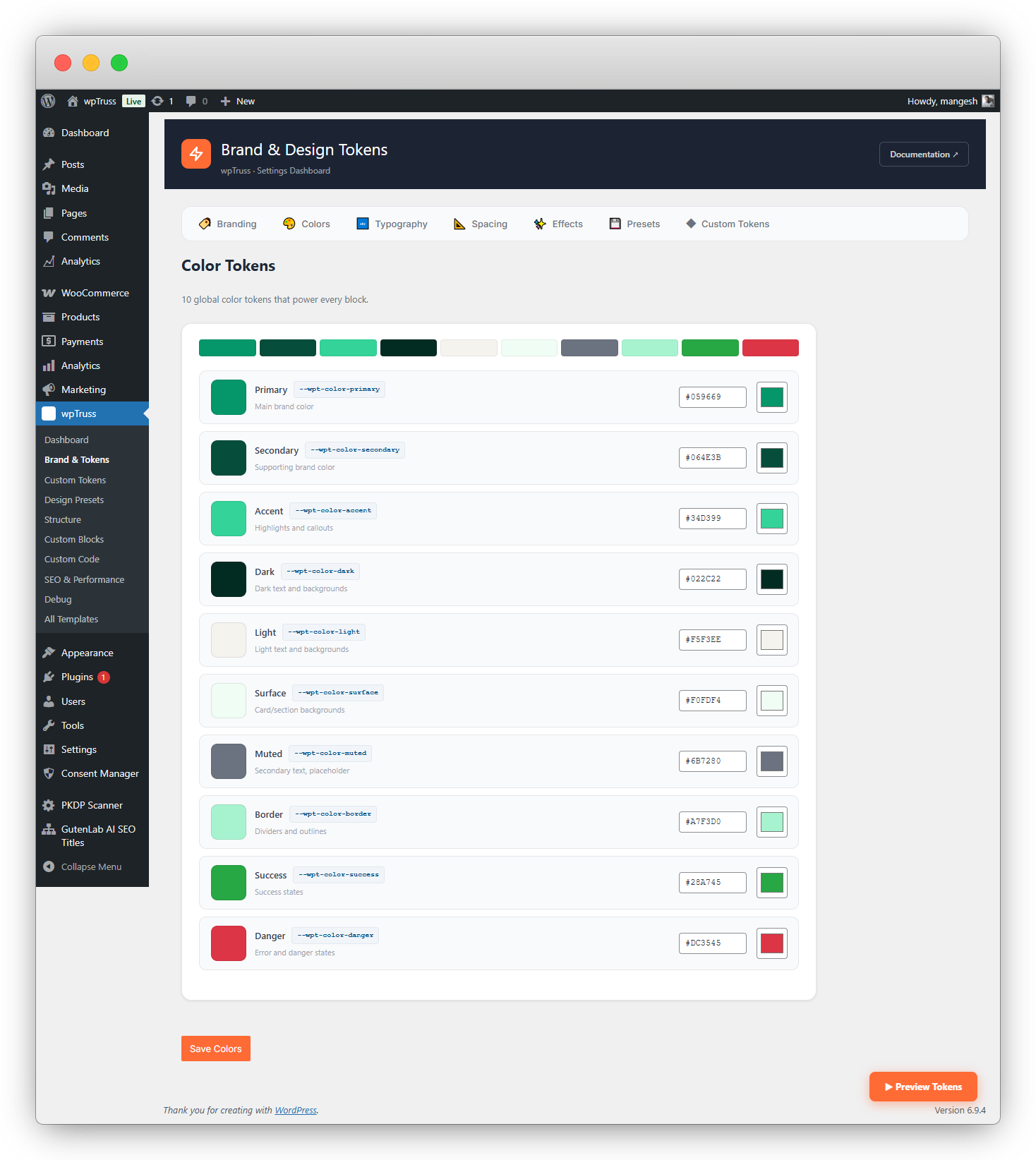
Your entire site’s visual identity – colors, spacing, typography, shadows, radii – lives in 141 CSS custom properties. Every block consumes only tokens. The validator rejects any block that tries to hardcode a hex value.
- Client rebrand: change one token, entire site updates in seconds
- Add up to 50 additional custom tokens for project-specific needs
- Tokens auto-injected into every block, every page – zero setup per block
- Validator enforces token-only architecture – no exceptions possible
Update once.
Every block gets it.
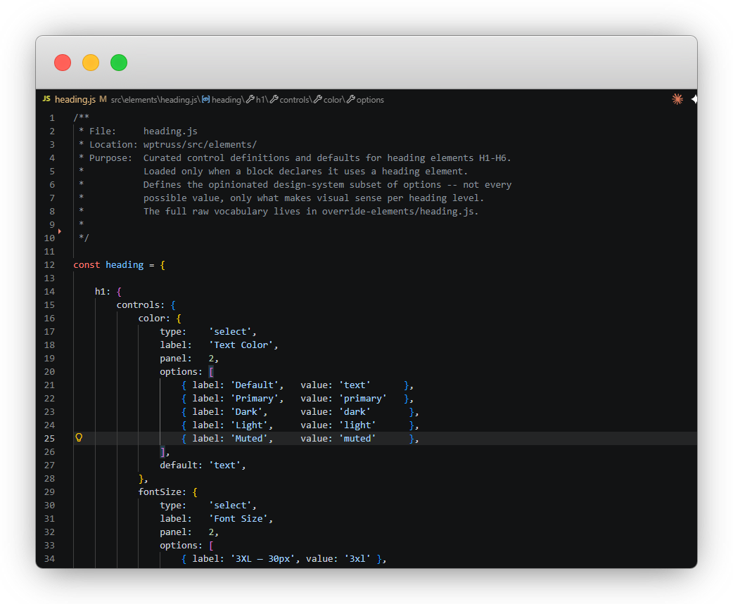
Heading, button, image, badge, eyebrow text, icon – 18 shared UI elements, each with defined default
properties. Update button.js to add a
new color variant and every block that uses a button gains that option. Instantly. Without touching a single
block file.
- 18 shared elements – heading, image, button, badge, eyebrow, icon + more
- Each element has defaults: style, color, size, radius – pre-configured
- Add a new element type (e.g. from a third-party plugin) and register it once
- Block editor panel updates propagate to every block that uses that element
const button = {
controls: {
color: {
options: [
{ label: ‘Primary’, value: ‘primary’ },
{ label: ‘Secondary’, value: ‘secondary’ },
// ↓ Add here → ALL blocks update
{ label: ‘Gold’, value: ‘gold’ },
],
default: ‘primary’,
},
},
};
✓ 18 blocks updated automatically
Add a new option once.
Every block gets it.
Future-proof by design.
Structure, spacing, and layout panels are defined once in the registry and shared across all blocks. If tomorrow you decide to add something new — an extra heading level, a larger spacing value, a new layout variant — add it centrally and it appears across every block automatically, without touching individual block files.
- Structure panel: heading levels, text hierarchy, content order
- Spacing panel: sizing (xs → 5xl), padding, gap – all managed centrally
- Layout panel: alignment, width, column options – propagated automatically
- No npm compile step required – changes reflect immediately
spacingOptions: [
{ label: ‘XS’, value: ‘xs’ },
{ label: ‘SM’, value: ‘sm’ },
{ label: ‘MD’, value: ‘md’ },
{ label: ‘LG’, value: ‘lg’ },
{ label: ‘XL’, value: ‘xl’ },
// ↓ New option – all blocks get it
{ label: ‘5XL’, value: ‘5xl’ },
]
✓ Appears in every block’s spacing panel
✓ No npm. No compile. No block edits.
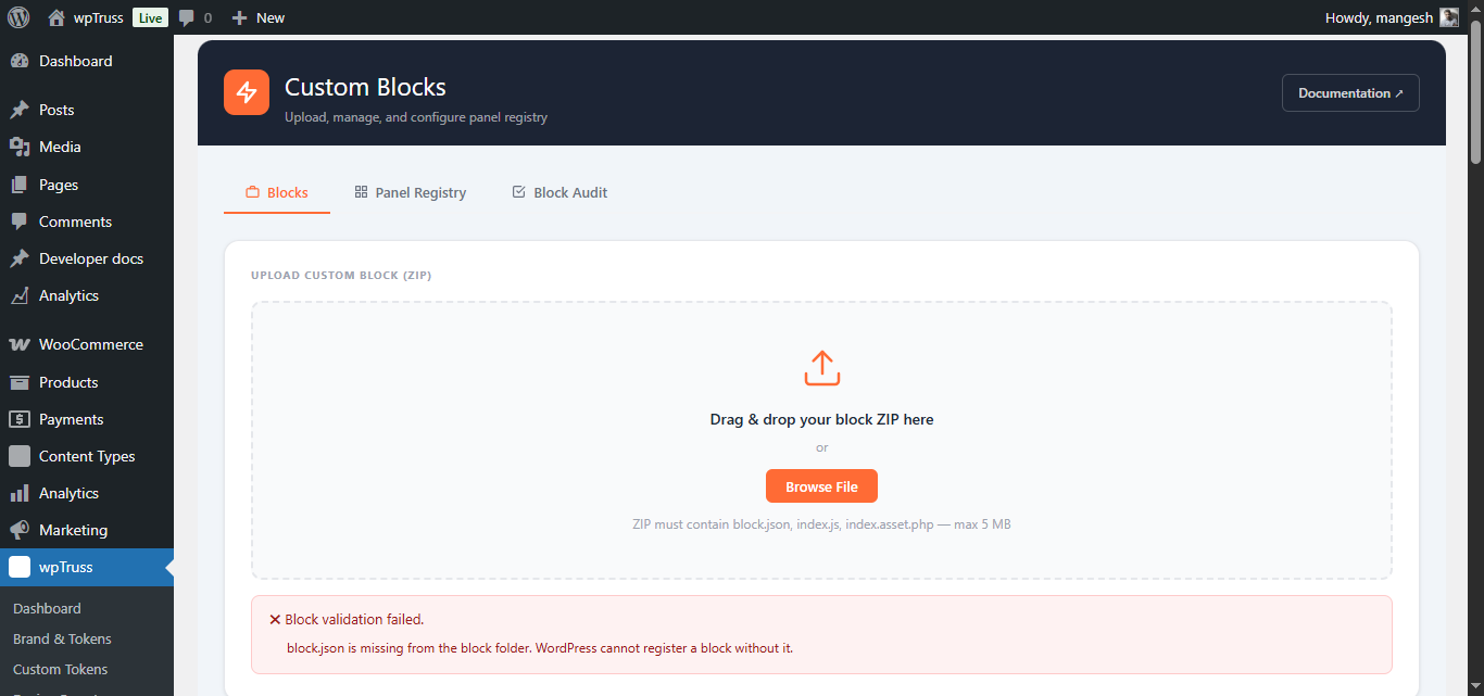
12 rules checked.
Bad code rejected.
The Block Validator runs 12 governance rules on every block at upload. Wrong namespace, hardcoded colors, missing attributes, forbidden JS patterns, motion layer violations – all rejected before they can pollute your system. Junior devs literally cannot ship div-soup.
- 12 governance rules checked on every block registration
- Hardcoded hex values rejected – must use tokens or fail validation
- All blocks use render.php – zero block validation errors in WordPress core
- Blocks that fail validation are blocked from the registry until fixed
✓ wptruss/feature-split – passed (12/12)
✓ wptruss/pricing-table – passed (12/12)
✓ wptruss/woo-mini-store – passed (12/12)
✗ custom/my-block – FAILED
→ Hardcoded color #FF0000 found.
Use –wpt-color-primary.
→ Wrong namespace. Use wptruss/
prefix or registered namespace.
// Block rejected. Fix required before
// it can be added to the registry.
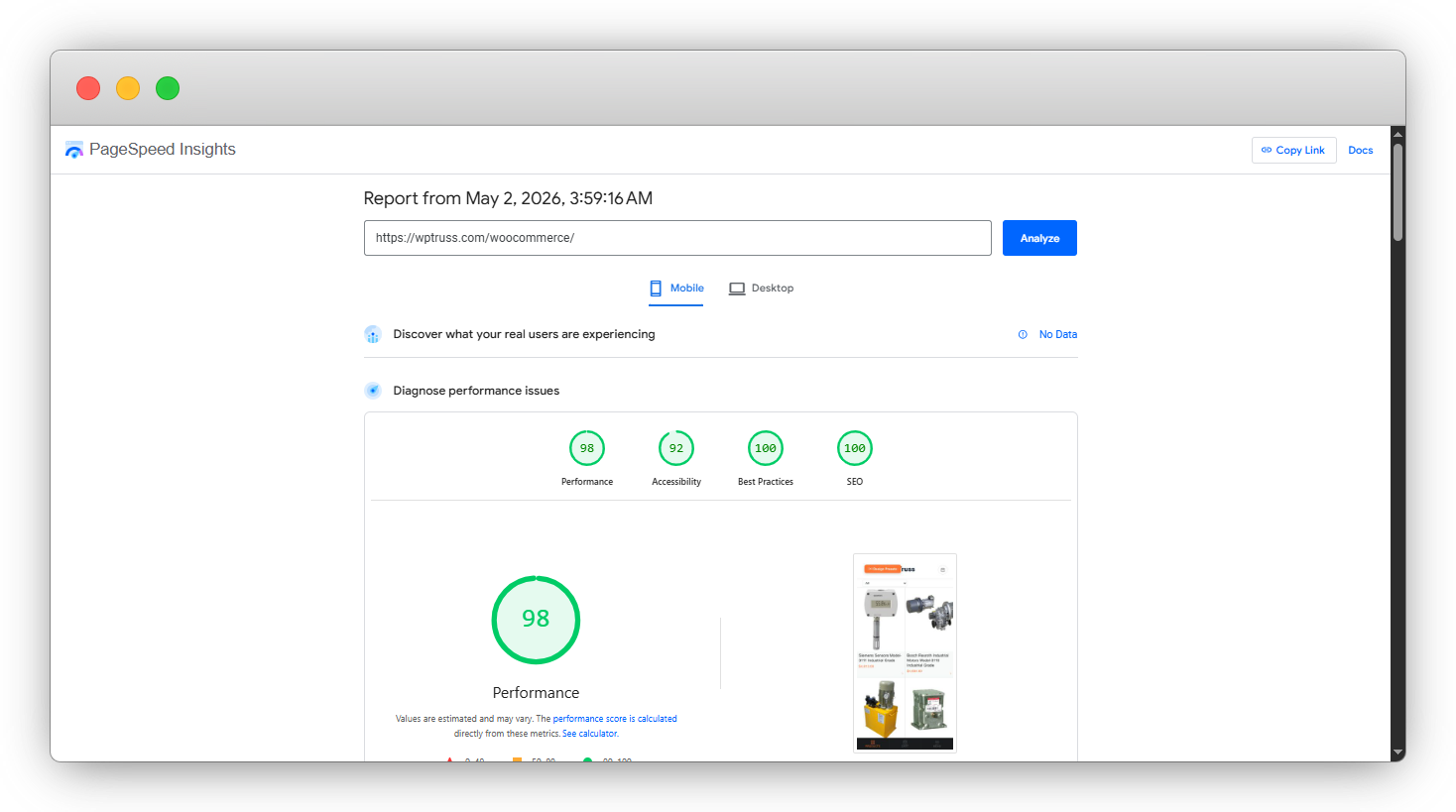
95+/100 isn’t the goal.
It’s where you start.
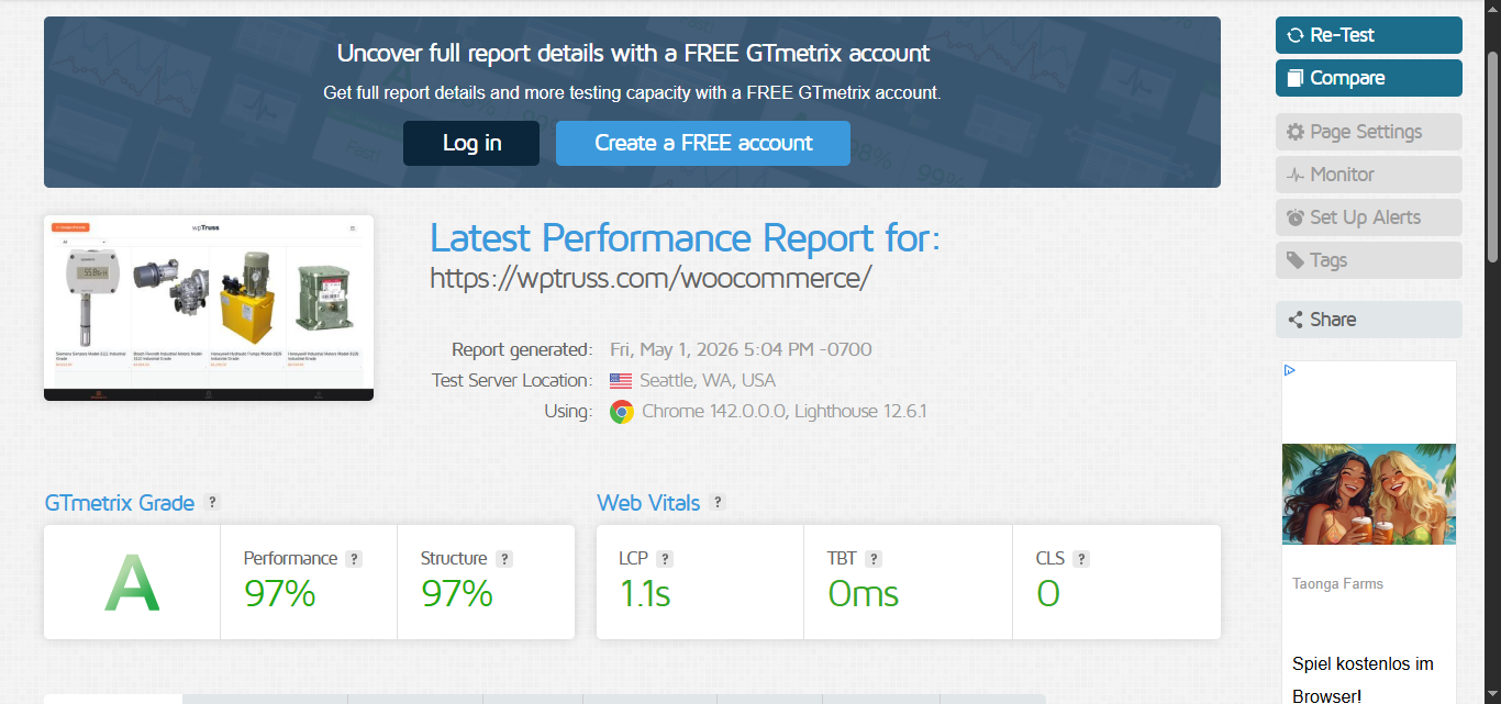
These scores are from a real WooCommerce site – with a full cart, infinite scroll products, load products using AJAX, and zero extra caching plugins. No CDN. No optimization passes.
Mobile
Desktop
Grade
Practices
Score
No caching plugin. No CDN. No manual optimization. The architecture produces this result by design – per-page CSS/JS bundling, deferred scripts, auto image optimization, and zero plugin bloat.
This is what $699 gets you.
Forever.
141 CSS custom properties. 50 additional custom token slots. One change updates every block, every page, across your entire site. Rebrands take minutes, not weeks.
18 shared UI elements – heading, button, badge, image, icon, eyebrow, and more. Update any element once. Every block using it gets the update instantly.
Structure, Spacing, and Layout panels defined once, shared everywhere. Add new options – h7, 5xl spacing, new layout – and every block’s inspector updates automatically.
Architecture governance enforced at upload. Hardcoded values, wrong namespaces, bad patterns – all rejected before they reach your registry. Junior-dev-proof by design.
Per-page CSS/JS bundling. Only styles for blocks on the current page are loaded. One HTTP request instead of eight. This is why 95+/100 is automatic, not aspirational.
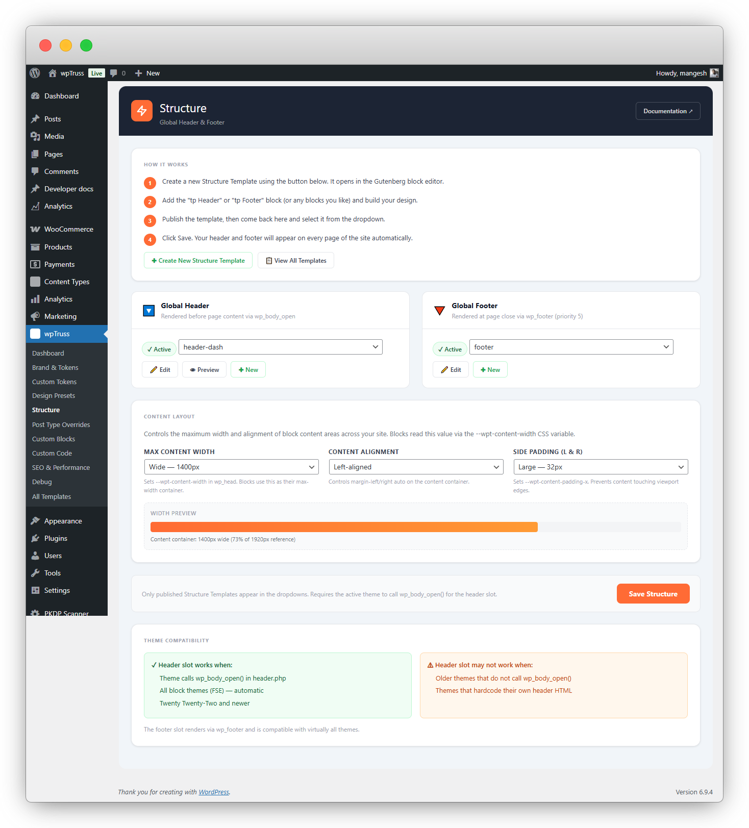
There’s no theme. Your site is built with structures – composable, block-based layouts. Custom CPT layouts, homepage, archives – all assembled from blocks like Lego.
Elite early members get unlimited access to the wpTruss block marketplace – forever, no monthly fee. Regular users pay recurring. You locked in your lifetime pass at $699.
Foundation, Constitution, Registry, Pattern Lab – 49 articles covering every edge case, every troubleshooting scenario. Enterprise-grade documentation from day one.
JSON-LD structured data in FAQ, Pricing, and Review blocks. Meta management in the block editor sidebar. 100/100 SEO. No SEO plugin needed.
This is not a side project with a 3-page readme. wpTruss ships with 49 technical articles – written, structured, and maintained as enterprise-grade documentation. Every system. Every pattern. Every edge case.
When a developer joins your agency, they don’t dig through your codebase. They read the docs. That’s how you eliminate key-person risk without a 3-week handoff.
Browse the docs ↗Questions developers actually ask before switching.
141 CSS custom properties are injected into every page – colors, spacing, typography, radii, shadows. Every block references only these properties. The Block Validator rejects any block that tries to use a hardcoded value (e.g. #FF0000 instead of var(–wpt-color-primary)).
You also get 50 additional custom token slots if you need project-specific properties. Change one token value – your client’s primary color changes on every button, every heading, every border across the entire site. No find-and-replace. No CSS hunting.
The element registry is a set of JavaScript files – one per UI element (heading.js, button.js, image.js, badge.js, etc.). Each file defines the element’s controls (what settings appear in the block editor), its defaults, and its render behavior.
When you update an element file, every block that uses that element automatically gains the update. No block-by-block changes. The registry is the single source of truth for all shared UI behavior.
The validator runs 12 governance rules when a block is uploaded or registered. It outputs a pass/fail result for each rule with specific error messages. A block cannot be added to the registry until all 12 rules pass.
Rules include: correct namespace format, no hardcoded hex values, no forbidden JS patterns, required attributes present, render.php used (not save.js), no motion layer violations, and more.
Yes. The WooCommerce microsite(Designed for mobile/small devices) is live at wptruss.com/woocommerce. It includes a full product listing with infinite scroll, AJAX add-to-cart, cart management, and proceed to woocommerce default checkout process – all inside a single native WordPress block(except checkout process)
The site scores 95+/100 on Google PageSpeed and GTmetrix Grade A. This is without a CDN, without caching plugins, and without any performance optimization passes. The architecture produces the score.
No. This was one of the unexpected wins during development. The system does not require npm or a compilation step to use blocks or update the system. Changes to the token system, element registry, and panel registry are reflected immediately without any build process.
This makes it significantly easier to onboard team members and manage the system across multiple clients.
wpTruss has no theme. Instead of a theme, everything on the site is a block. The site structure – header, footer, sidebar, page layout – is assembled from blocks just like the content is.
This means you can create custom layouts for different post types (CPTs) using blocks, build the homepage using blocks, and customize archives using blocks. It’s Lego all the way down. And because everything is blocks governed by the token system, you get 95+/100 PageSpeed regardless of how complex your layout is.
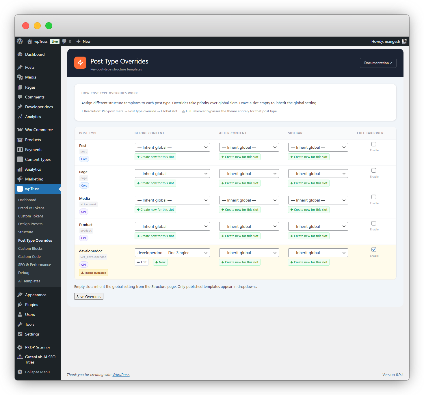
Yes and this is one of the more unexpected capabilities of the system. Because wpTruss replaces the traditional theme layer with block-based structures, you can assign completely different layouts to different post types without touching a theme file or writing template hierarchy PHP.
Need your WooCommerce product pages to use a two-column layout with a sticky sidebar? Build it with blocks. Want your case study CPT to have a full-width hero and a narrow prose column below? Build it with blocks. Your blog archive, your team member pages, your event listings, each one gets its own structure, assembled from the same governed block system.
The key difference from traditional WordPress template overrides is that everything stays inside the token and registry system. A layout built for a CPT inherits the same design tokens, the same element registry, and the same panel controls as every other block on the site. So your custom post type layouts don’t drift visually from the rest of the site; they’re governed by the same rules automatically.
The wpTruss Marketplace is where professional, governance-compliant blocks will be available for download. Every block in the marketplace passes the 12-rule validator and is built to the wpTruss block constitution, so it drops into any wpTruss site without breaking your architecture.
Regular users will pay a monthly or annual subscription to access the marketplace, along with purchasing blocks using credits or one-time unlocks.
As an early member, your access fee is permanently waived. The $699 is your lifetime marketplace pass. You will never pay any recurring subscription to access the marketplace.
You still pay for the blocks you choose to use, but anything you unlock is owned permanently and can be reused across your projects.
As the library grows, the value of having lifetime access compounds over time.
Unlimited sites. There’s no per-project licensing, no seat limit, no domain restrictions. Pay once, use it across every client project you run. Your $699 covers your entire agency’s output.
We know what your last
Gutenberg project felt like.
It started clean. A design system in Figma. A shared CSS file. A Notion doc with naming conventions everyone agreed on. Then month two happened. A junior dev hardcoded a colour. A client asked for “just one more button style.” Someone duplicated a block instead of editing the original. And slowly – so slowly you didn’t notice until you were knee-deep in it – the entropy set in.
You’ve probably tried every workaround developers try before they accept the system is broken:
The system won’t let
your team break the site.
This isn’t about trusting your developers. It’s about building a system where trust is irrelevant – because the architecture enforces the rules automatically.
The 12 Governance Rules aren’t restrictions – they’re a guarantee. Every block that enters your system has been checked for hardcoded values, wrong namespaces, forbidden patterns, and missing attributes. If it fails even one rule, it doesn’t get in. Full stop.
When a junior developer joins your agency tomorrow, they get the full system – with guardrails. They cannot hardcode a colour. They cannot ship a block that breaks the design system. The validator catches it before it ever reaches production.
The Panel Registry means every block’s editing experience is consistent. Spacing options are always the same set. Layout options are always in the same place. No more “what does this button do?” support calls at 9am on a Monday.
One price. One time. Forever.
100 Elite Early Access spots. After that, the price goes up. And recurring fees kick in for marketplace access.
- ✓ wpTruss plugin access
- ✓ Design token + element registry system
- ✓ Block validator
- ✗ Marketplace access included – pay separately
- ✗ No lifetime guarantee
- ✗ No Elite Early Access pricing lock
- ✗ No early access to roadmap
- ✓ wpTruss plugin – unlimited sites
- ✓ Design token system, element registry & block validator
- ✓ Lifetime Marketplace Access (no monthly fees, ever)
- ✓ All 49 documentation articles
- ✓ Lifetime updates – no renewal
- ✓ Roadmap features included (CPT governance + more)
- ✓ Elite Early Access pricing lock – price never rises for you
This isn’t for everyone.
But if you’re tired of rebuilding WordPress projects and want a system that enforces structure
wpTruss is exactly what you’ve been missing.
- ✗ You want drag-and-drop simplicity with no code
- ✗ You build single one-off sites with no reuse
- ✗ You don’t understand what design tokens are
- ✗ Technical debt doesn’t affect your current workflow
- ✗ You’re happy with your current 40/100 PageSpeed
- ✓ You run an agency managing 5+ WordPress sites
- ✓ You’ve debugged block conflicts at 2am
- ✓ You understand design tokens and want architectural consistency
- ✓ You’ve lost a dev and spent weeks on key-person risk
- ✓ You want to promise 95+/100 PageSpeed before the project starts
- ✓ You value systems over “creative freedom”