Canvas (2)
Page background layers. All content sits on top of these.
| Token | Default |
|---|---|
--wpt-color-background |
#FFFFFF |
--wpt-color-background-alt |
#F8F9FA |
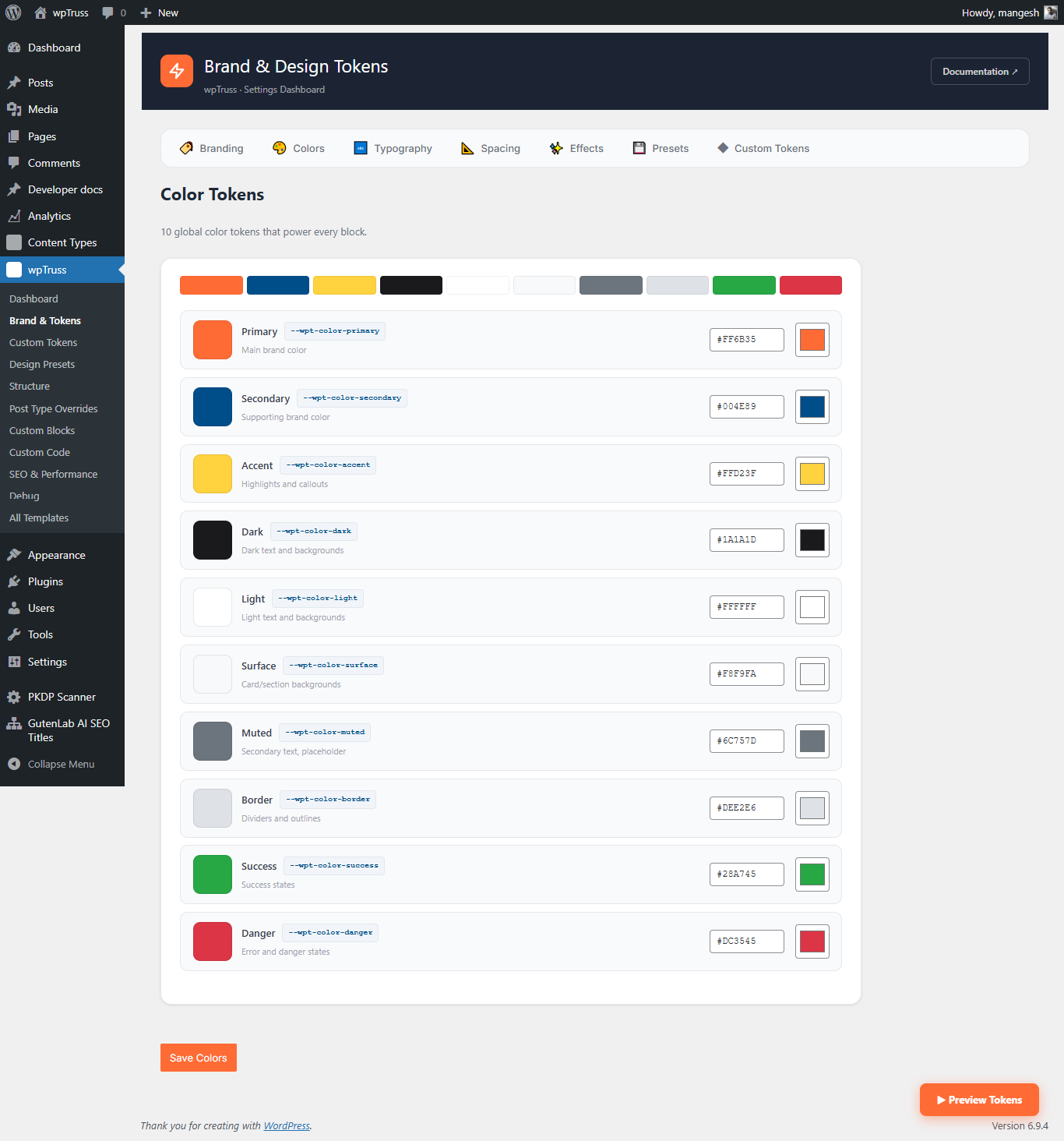
Brand Colours (10)
Core identity palette. Configured first in Brand Settings.
| Token | Default |
|---|---|
--wpt-color-primary |
#FF6B35 |
--wpt-color-secondary |
#004E89 |
--wpt-color-accent |
#FFD23F |
--wpt-color-dark |
#1A1A1D |
--wpt-color-light |
#FFFFFF |
--wpt-color-surface |
#F8F9FA |
--wpt-color-muted |
#6C757D |
--wpt-color-border |
#DEE2E6 |
--wpt-color-success |
#28A745 |
--wpt-color-danger |
#DC3545 |
Surface Extensions (2)
Depth hierarchy for layered UI.
| Token | Default |
|---|---|
--wpt-color-surface-raised |
#FFFFFF |
--wpt-color-surface-sunken |
#F1F3F5 |
Text Colours (6)
Kept separate from brand colours for independent control.
| Token | Default | Use for |
|---|---|---|
--wpt-color-text |
#1A1A1D |
Primary body text |
--wpt-color-text-inverse |
#FFFFFF |
Text on dark backgrounds |
--wpt-color-text-on-primary |
#FFFFFF |
Text placed on the primary colour |
--wpt-color-text-on-secondary |
#FFFFFF |
Text placed on the secondary colour |
--wpt-color-link |
#004E89 |
Hyperlink default state |
--wpt-color-link-hover |
#FF6B35 |
Hyperlink hover state |
Status Colours (4)
| Token | Default |
|---|---|
--wpt-color-success |
#28A745 |
--wpt-color-danger |
#DC3545 |
--wpt-color-warning |
#FFC107 |
--wpt-color-info |
#17A2B8 |
Accessibility Tokens (5)
Never set these to transparent or invisible values. They exist to meet WCAG requirements.
| Token | Default |
|---|---|
--wpt-color-focus-ring |
#FF6B35 |
--wpt-color-selection |
#FFD23F |
--wpt-color-overlay |
rgba(0,0,0,0.5) |
--wpt-color-scrollbar-thumb |
#DEE2E6 |
--wpt-color-scrollbar-track |
#F8F9FA |
Note: ::selection cannot use CSS custom properties directly due to a browser spec limitation. The token engine emits a separate ::selection { background-color: ... } rule using the resolved value of --wpt-color-selection.